Aberdeen Civic Society Awards 2013
Awards
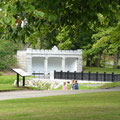
Duthie Park
This well-loved and well-used Victorian park in Aberdeen has recently had a makeover. It had deteriorated and efforts were made over
recent years to raise the finance to do restoration work. The Heritage Lottery Fund gave assistance, the Council were in charge and all of this was encouraged by an active Friends group
under the leadership of Tony Dawson.
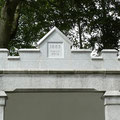
What has been done here is restoration. Putting back features that had become lost, fountains, ponds, mounds for flags, terraces, railings and gates. It is an absolutely fabulous restoration project, and one that the Awards Committee felt ticked so many of the boxes that is our remit, particularly when it came to amenity. The contribution to the community from this work will last for generations, and this is likely to last because of the active interest and involvement of the Friends. Those who have put their time, money and effort into the work deserve congratulations, and it is another example (along with Marischal College) of how Aberdeen City Council has shown, by example, that it can carry out work that restores the heritage of our city.
Much of the work is of an extremely high standard. Details in the granite work are particularly notable, and you can see this everywhere when you visit - the way that the new steps have been formed linking the river, through the terrace and up to the main open space in the park, the restored ponds, walls and the flagpole.
There were one or two comments about the issue of parking from members of the committee as we considered the nomination, and some felt that the amount of parking was possibly not enough. However instead of just adding more parking, a better solution may be for the council to ensure that there are enough similar parks in the developments around Aberdeen that people can easily walk to, and thereby reduce the need to take a car when visiting a park for a day out.
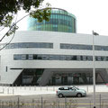
RGU – New Academic building at Riverside East
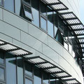
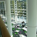
This is a new building on the Robert Gordon’s University campus overlooking the River Dee. You may well have seen the green circular building that has gone up over the last year and a half – well this is the university’s new library - RGU’s attempt not to be out-done by the glass box that is Aberdeen University’s library that we considered made an award to last year.
We were shown around the buildings by Shane McGinn. In actual fact calling it a building is not a good description; more accurately it is a group of buildings laced together by an internal street. The buildings house the pharmacy and engineering schools as well as the library. It has café’s, bars, break out areas and roman amphitheatre style performance areas. The buildings curve as a reflection of the shape of the Dee.
Shane commented on our visit that he did not know how any student was going to manage to work in the library because they are likely to spend all their day looking out at the panoramic views over Aberdeen. That’s probably not far off the mark, because the views from the top of the circular building are really quite stunning.
Many of the graduates in our party - who probably were at university shortly after the war - were walking around this brand new set of buildings muttering to themselves about how being at University in their day was nothing like this! I have to say that even I was thinking that! It is pretty amazing. There is no doubt that this latest addition to the RGU campus is seriously classy; the spaces, the heights, the colours, the light, the volumes and the scale. It must have been an architect’s nightmare to make sure that it all worked, and that levels and bridges were in the right place and that it could all work with today’s exacting building regulations. For all those professionals out there all I can say is “what a fee”!
We visited just as the university was getting ready for the influx of new students. Everything was so clean and brand new. Term has now started and with time the students will make their presence known. However, I am sure that when they arrived in the new building they will have been as impressed as we were. This is quite some addition to the RGU campus and to the city of Aberdeen. It is an investment that will do much to propel RGU even further up the list of desirable places to study in the UK. Very impressive indeed.
Award For Craftsmanship
Maggie's Centre joinery/cabinet making
An Award for Craftsmanship is given to those who we feel have demonstrated an understanding of the impact on their surroundings of getting the details right. When the details are executed correctly, and to the highest standards they make a significant contribution to place making.
Commendation
Maggie's Centre Aberdeen
The new Maggie’s centre in Aberdeen has had a fair bit of publicity when it opened a few weeks ago. It is located on the edge of the Foresterhill Hospital Campus and is visible from Westburn Road. I can guarantee that anyone living locally will have heard of it and probably also seen or been a part of various fundraising activities, which included plastering images of various local worthies all over the sides and backs of double decker buses!
It is an interesting shaped building, described by some as a pebble or a spaceship. After seeing it in real life, one of the committee called it a donut.
There are a number of interesting things about the building. It is actually quite small. Internally separate spaces, or “rooms”, are formed just by the positioning of cupboards, stairs or other wood panelled partitions. There are two floors in the building, with the upper floor more of a mezzanine level containing seating areas and leading to the outside balcony.
From a construction point of view the formation of the concrete shape could not have been easy. There is hardly a straight line in the place, the whole building curved in three dimensions. There is a sheltered courtyard area at the front which faces west and will therefore receive warm evening sun.
Internally the standard of the joinery and woodwork is very impressive. The term joinery doesn’t really do it justice; it is more like cabinet making with hardly a straight line in the place. The unusual external shape forces the unique internal shapes; they could not be anything else. Painstaking work and time has obviously been spent making sure it all fits together, and the result makes you want to just explore. It is not big, and therefore not intimidating, but it is actually a very attractive and comforting building. I have no doubt that it will become popular with those use it.
Ashley Lodge
The work we considered here was the first phase of a project involving the conversion of an old building, the demolition of parts and construction of various additions. Future phases involve more new build. It is a residential scheme on the corner of Great Western Road and Pitstruan Place.
Effort had been made to ensure that new parts of the building that face Great Western Road - the front elevation - fitted well with the existing building. Instead of contrasting with the old, the new bits work with it, remaining subservient to the original building. The proportions have been respected, and the materials and detailing are all good. The rear of the building includes a more modern style, but still remains reserved. Small matters, like the way that the newly formed archway from Pitstruan Place has a traditional look, helps to make the public appearance one of harmony with its surroundings rather than conflict. We felt that this was such a welcome relief today where contrast seems to be more the norm.
I don’t think that anyone on the Awards Committee saw anything that they did not like about the work, and we look forward to seeing a similar attention to detail in the next phase of the building work.
Astoria, Culter House Road
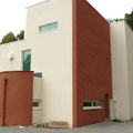
I would defy anyone to drive past this house and not want to stop and take a photograph. There is no doubt that it is an interesting property. The area around it is mainly a mix of suburban houses in Culter House Road, some old and some new. This house just sits within a pretty and established plot surrounded by trees.
We felt that this was the best house of all the new single houses that we were considering in this year’s nominations. Some described it as “splendid” and others could see it being used to film an episode of Poirot. Despite being a bit block-like it was very unusual and it is fair to say that everyone on the committee liked it, sitting as it does, an unusual and modern design, all at peace within lovely landscaped grounds.
106 Malcolm Road
The second house we looked at was much more generous, both in terms of its site and property size. It has the appearance of a small terraced house “bookended” at each end. It therefore has strong symmetry, something that was lacking in the smaller house in Malcolm Road.
The committee thought that this property had character and made a statement. Some of the architects on the committee felt that there was something not quite right. It may have been its size (as the property really is fairly big), the relative proportions of the front elevation or the window openings. The exposed guttering and downpipes at the front could have had better detail or have been made in a different material. However, the general impression was favourable and one thing that did impress us all was that the standard of design was high and yet this was achieved without a firm of architects involved in the design work at all.
Mention
ENGTEQ
ENGTEQ’s fabulous new building in Altens looks out from the current edge of the Industrial Estate towards the North Sea. It resembles nothing you have seen before with expanses of reflective coloured glass crouched rather like a giant frog ready to pounce down the slope.
The building here generated many adjectives as we discussed it, like sophisticated, elegant, simple, outstanding and striking. The glass corners and clean lines were praised.
It is unfortunate that the location of the building does it no favours. Due to the reflective glass you can see some of the adjacent buildings, which were described by one member of the committee as “dross”. The car park tends to dominate the front of the building and because of the reflective glass the parking area seems extra big because it is similarly reflected in the glass. Being overly critical, the entrance to this startling building is probably a bit on the small side.
The committee was however impressed. The owner and designer had put some effort into doing something better than is normal for an industrial building. Industrial estates need of this type of approach to improve their general ambiance and therefore we strongly felt that this is something that should be encouraged.
City View Business Park
This is a new development of offices in West Tullos industrial estate. It lies in amongst the new car showrooms on Wellington Road, and in its previous life was, I think, the Renault dealership. We considered the first phase of the work, which involves two completed buildings. A third building is still under construction.
Bearing in mind this building is located in the middle of a sea of new car showrooms, where it is important to have cars on public display; it was a relief to see that this development does not show off the cars, it takes them round the back and out of sight. The buildings are located closer to the street because of this and so they do, to some extent, address the street. It is a shame that there is no direct pedestrian access from the street into the buildings, but this is probably because of the slope on the site which would have made this difficult to achieve.
The building is a bit dark and much use has been made of black and dark grey in the materials palette. Indeed the materials that have been used are nothing special. This split the committee and caused some discussion, even to the extent that one of the team (who was in a minority I might add) commented that it was the best looking soviet bloc building he had seen in Aberdeen! None of the rest of us was that sure whether or not this particular member of the group had ever been to the Soviet bloc, but it certainly made for a lively discussion. When we had all calmed down we took a slightly more balanced view and the committee felt that it was good to see that an attempt has been made in an industrial estate to address the street with the building rather than a car park and felt that this made it a worthy entrant to this year’s list.
6 Ruthrieston Cresent
This is a new block of flats located in an area that would have originally been local authority built housing. It is visible from South Anderson Drive, particularly if you have to wait in a queue of traffic heading south to get onto the roundabout at the Bridge of Dee.
There were some diverse opinions about this scheme. It was liked because it is relatively pleasing to the eye, particularly when viewed in the context of its surroundings which are not that special. It is a tidying up of the site and the scale of the new building is consistent with what exists close by. It does not appear to overpower.
However some felt that the building was let down by some of the detailing, for example the details at the windows. The front was unfortunately a car park and the building line does not appear to relate to any of the existing buildings.
Despite all of this, the committee thought that this development fitted in well and actually made a significant improvement to the built environment in the area. It was therefore very worthy of consideration.
597 Holburn Street
This is a site formerly occupied by an Esso filling station. You can see that the block addresses the street, set back a little by a small front garden. The design of this building creates activity in the street because there is an arch leading to the car park at the rear and the front elevation also has two front doors leading out directly onto Holburn Street. A clever arrangement exists to cater for the required level access arrangements, whilst still allowing for steps.
The committee felt that this block of flats was the better of two others that were considered in the same vicinity; it has an interesting frontage and addresses the street well. Some of the detailing was mixed, for example the red banding at the upper level may well date fairly quickly and the boxes for the services are visible from the street at the front. However, an effective attempt has been made, through using horizontal banding at positions on the front elevation, to link the various elements together, like the windows and doors.
- Loading Twitter messages...
Aberdeen Civic Society is a registered charity, number SC003089 and is registered with the Scottish Civic Trust


